phylepic charts: combining phylogenetic trees with epidemic curves
Source:vignettes/phylepic.Rmd
phylepic.RmdThis document steps through creating and customising phylepic charts using an example dataset.
Preparing the data
This example uses a real tree from a foodborne enteric pathogen. The
tree is loaded in from a Newick file using the ape
package:
tree <- read.tree(system.file("enteric.newick", package = "phylepic"))
plot(tree)
The tree comes with some metadata that has been manipulated for illustration. The metadata includes a name and collection date for the samples, whether they are environmental or clinical isolates (if known), and a label for any isolates that were assigned to a genomic cluster. These are read in from a CSV file:
metadata <- read.csv(system.file("enteric_metadata.csv", package = "phylepic"))
str(metadata)
#> 'data.frame':    50 obs. of  4 variables:
#>  $ name           : chr  "NSW-0004" "NSW-0020" "NSW-0029" "NSW-0042" ...
#>  $ collection_date: chr  "2013-02-18" "2016-11-19" "2017-01-13" "2017-02-28" ...
#>  $ source         : chr  NA NA NA NA ...
#>  $ cluster        : chr  NA NA NA NA ...
The only requirements here are that we have a column that corresponds
to the tip labels from the tree (here called name), and one
that has dates represented as Date objects. We’ll also
indicate the two columns with categorical data by converting them to
factors:
Basic plotting
To start with, we should get the tree looking how we want it. You
might want to root or re-root the tree (see ape::root),
reorganise the tip order (ape::ladderize), or prune away
parts of the tree that aren’t relevant. For now, let’s extract a single
clade from our larger tree:
clade.parent <- ape::getMRCA(tree, c("NSW-0324", "NSW-0330"))
clade <- ape::extract.clade(tree, clade.parent)
plot(clade)
The phylepic() function joins a tree with its metadata
and does some consistency checks. It can help you to drop tips without
metadata if desired. It’s also where we identify which columns of our
metadata correspond to the tip labels and dates. The resulting
phylepic object has a plot method that guesses sensible
defaults:
phylepic(clade, metadata, name, collection_date) |> plot()
#> Warning in autoplot.phylepic(object = x, ..., plot.tree = plot.tree, plot.bars
#> = plot.bars, : Replaced "x" scale limits:
#> NULL -> date_limits [phylepic: plot.epicurve]
#> Warning: Removed 1 row containing non-finite outside the scale range
#> (`stat_bin_auto()`). [phylepic: plot.epicurve]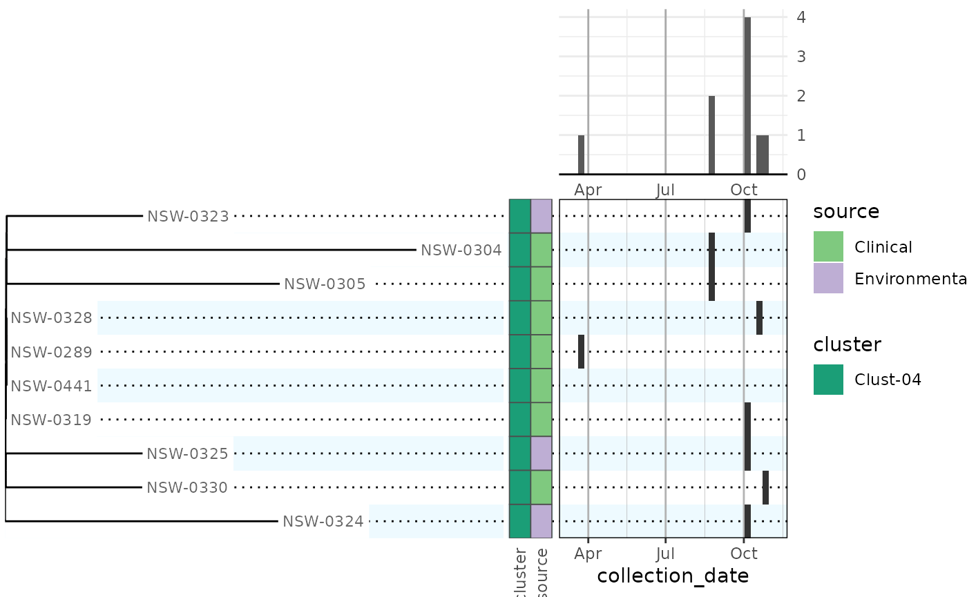
Metadata bars were added for all factor columns in the metadata frame, with different categorical colour scales. The dates were binned by week to give an epidemic curve in the upper right. The calendar panel in the lower right has the same weekly binning so that you can scan across from a tip on the tree and follow it up to the epidemic curve to find the collection date.
Customising the plot
Looking to the full dataset instead of just that single clade, the default plot needs some configuration to be useful:
phydata <- phylepic(tree, metadata, name, collection_date)

plot(phydata)
#> Warning in autoplot.phylepic(object = x, ..., plot.tree = plot.tree, plot.bars
#> = plot.bars, : Replaced "x" scale limits:
#> NULL -> date_limits [phylepic: plot.epicurve]
#> Warning: Removed 7 rows containing non-finite outside the scale range
#> (`stat_bin_auto()`). [phylepic: plot.epicurve]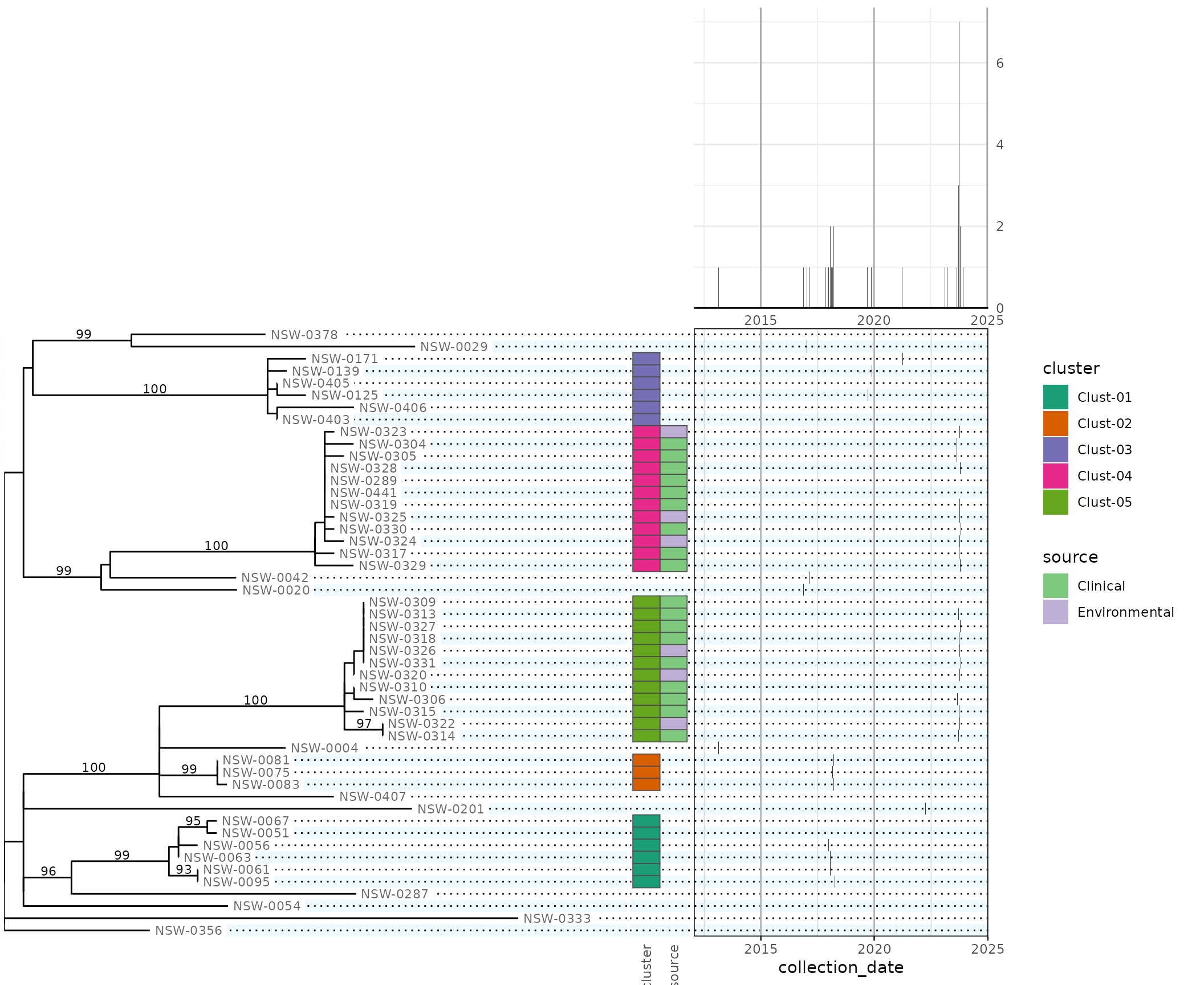
The date scale
The date range is too big for this type of chart, so we want to focus
in on a time period near the outbreak clusters Clust-04 and Clust-05. By
using scale_x_week, we get some conveniences such as being
able to specify the breaks (tick labels) in intervals of weeks:
date_scale <- scale_x_week(
  name = "Date of sample collection",
  limits = as.Date(c("2023-08-14", "2023-11-06")),
  date_labels = "%d %b",
  week_breaks = 4L,
  week_minor_breaks = 1L
)
Any date scale will do, however. The important thing to note is that
the data will be binned based on the breaks (the union of major and
minor breaks) of the date axis. So if you want weekly binning, ensure
that the minor breaks are 1 week apart. For annual binning, make them 1
year apart
(e.g. scale_x_date(date_breaks = "5 years", date_minor_breaks = "1 year"))
and so on. If you don’t want to bin at all, you can disable binning per
panel with plot_calendar(binned = FALSE) and
plot_epicurve(binned = FALSE).
We can choose the first day of the week to match the local conventions:
options(phylepic.week_start = "Monday")We can also control the relative heights of the two rows of panels in
the final grid using height.tree (choosing here to make is
6 times the height of the epidemic curve). Our date scale is passed to
both the relevant panels:
plot(phydata, scale.date = date_scale, height.tree = 6)
#> Warning: Removed 7 rows containing non-finite outside the scale range
#> (`stat_bin_auto()`). [phylepic: plot.epicurve]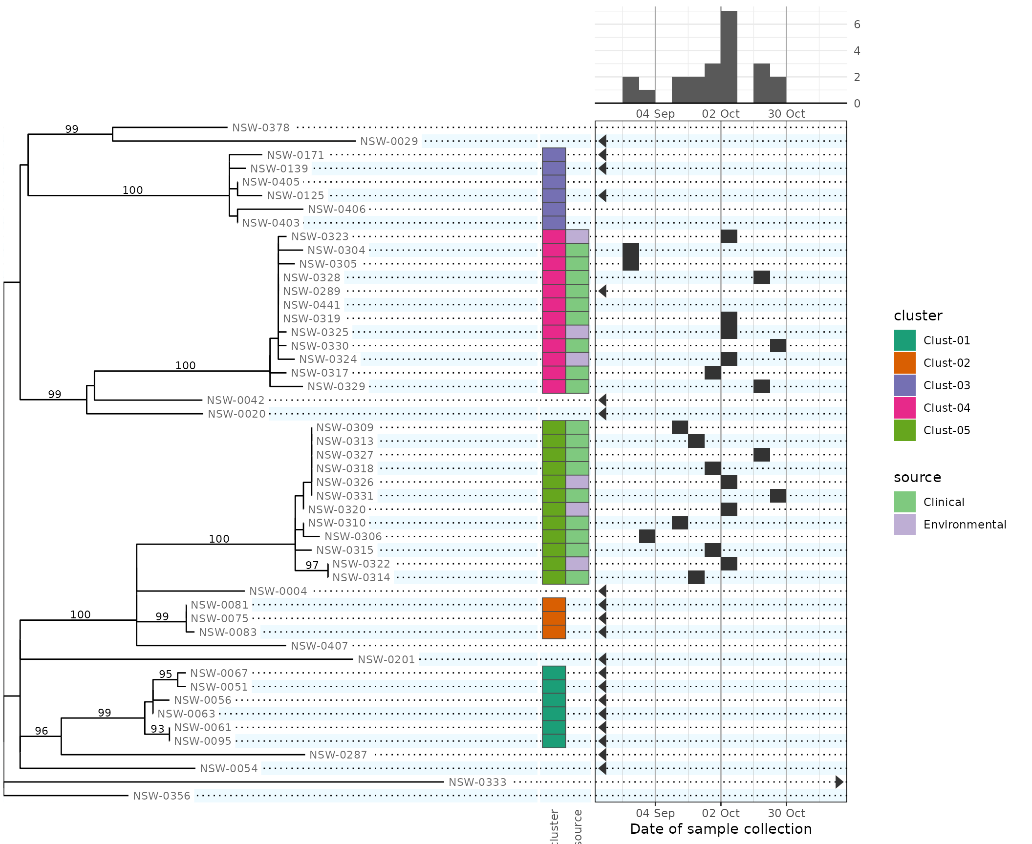
Note that dates outside our chosen date limits are drawn on the calendar as triangles at the corresponding edge of the scale. Some rows are missing date metadata, so this allows us to distinguish them visually.
Manipulating the tree
It would be nice to represent the genomic clusters using colours on
the tree tips instead of a separate column of metadata tiles, since
genomic clusters are based on the tree structure. The tree is drawn
using ggraph and its dendrogram layout. In order to add a new layer of
tip dots, we need to intercept the ggraph plot before it’s
assembled into the final chart.
Firstly, let’s manually define a colour scale for the clusters so that we can have it be consistent between panels:
cluster_scale <- scale_colour_brewer(
  # the name affects the legend title
  name = "Cluster",
  # these 3 parameters affect the colour choice
  type = "qual",
  palette = 2,
  direction = -1,
  # don't drop unused levels; we want consistency between panels
  drop = FALSE,
  # suppress the explicit NA entry in the legend; not all tips are in a cluster
  na.translate = FALSE,
  # we'll use this scale later for both fill and colour aesthetics
  aesthetics = c("fill", "colour"),
)
To manipulate the tree, we use plot_tree, which creates
the base plot to which we can add our new layers:
plot_tree(phydata) +
  # `filter = leaf` in ggraph geoms means that they only draw the tips
  ggraph::geom_node_point(aes(filter = leaf, colour = cluster), size = 2, show.legend = FALSE) +
  cluster_scale
#> Warning: Removed 11 rows containing missing values or values outside the scale range
#> (`geom_point()`). [phylepic: plot.tree]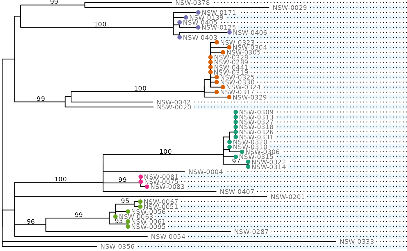
Note that the guides from each panel will be merged in the final
plot. If we don’t put show.legend = FALSE here, the guide
for the cluster aesthetic will show circles instead of squares for the
legend keys.
All of the columns from our metadata frame are available (for the tips) to use in ggraph’s aesthetic mappings.
Next, we’ll want to hide the redundant column of coloured tiles
corresponding to the cluster. Remember that this column was drawn
because the default plot.bars panel makes a column of tiles
for each factor column in out data frame. We can use
plot_bars to override the default behaviour. This helper
takes arguments in the form
<column name> = <scale definition>:
plot(
  phydata,
  plot.tree = function(x) {
    # this function will be called with x = phydata
    plot_tree(x) +
      ggraph::geom_node_point(aes(filter = leaf, colour = cluster), size = 2, show.legend = FALSE) +
      cluster_scale
  },
  plot.bars = function(x) {
    plot_bars(
      x,
      # 'source' is the name of the corresponding metadata column
      source = scale_fill_hue(
        name = "Source",
        # this just changes the colours
        h.start = 30,
        # as above, we want to turn off drop and na.translate
        drop = FALSE,
        na.translate = FALSE
      ),
      # if we wanted more tile columns, we would add them here
    )
  },
  scale.date = date_scale,
  width.tree = 20,  # new: also specify the relative widths of the 4 columns:
  width.date = 12,  #
  width.legend = 4, #
  height.tree = 6
)
#> Warning: Removed 11 rows containing missing values or values outside the scale range
#> (`geom_point()`). [phylepic: plot.tree]
#> Warning: Removed 7 rows containing non-finite outside the scale range
#> (`stat_bin_auto()`). [phylepic: plot.epicurve]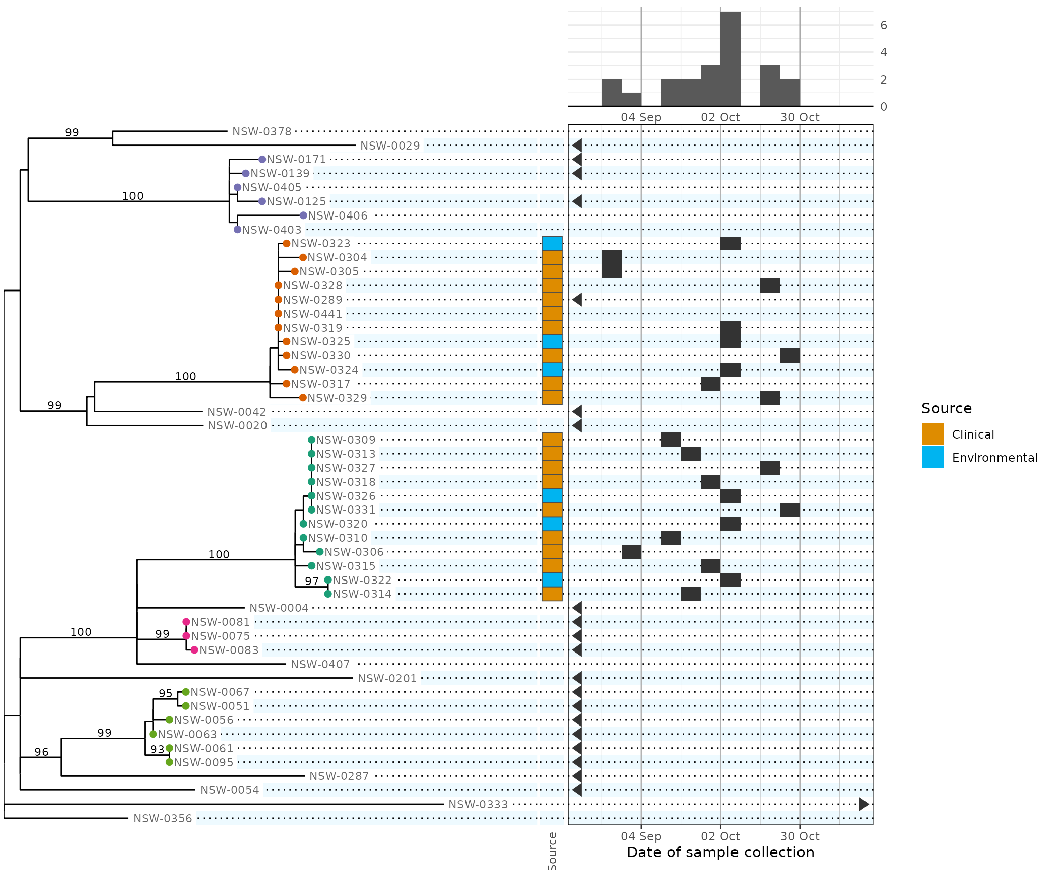
Each plot.* argument will normally be given a function
that is called with a single parameter: the phylepic object provided to
plot. The function must produce a ggplot object suitable
for aligning in the final chart.
For plot.bars in the above, we only wanted to override
the default options without adding any new custom layers. In common
cases like these we can reduce the boilerplate a bit:
plot(
  phydata,
  plot.bars = function(x) {
    plot_bars(
      x,
      source = scale_fill_hue(...)
    )
  }
)

# equivalent to the above
plot(
  phydata,
  plot.bars = plot_bars(
    source = scale_fill_hue(...),
  )
)
This is because the plot_* helpers return a function
instead of a ggplot if their first parameter is omitted.
Making use of the calendar and epidemic curve
The previous plot shows two clear genomic clusters associated with concurrent outbreaks. To make this point more clearly, we would like to indicate the two clusters on the epidemic curve (using the same colour scale).
To achieve this, we pass fill = cluster to both the
plot.epicurve and plot.calendar panels:
plot(
  phydata,
  plot.tree = function(x) {
    plot_tree(x) +
      ggraph::geom_node_point(aes(filter = leaf, colour = cluster), size = 2, show.legend = FALSE) +
      cluster_scale
  },
  plot.bars = plot_bars(
    source = scale_fill_hue(
      name = "Source", h.start = 30, drop = FALSE, na.translate = FALSE
    ),
  ),
  plot.epicurve = plot_epicurve(fill = cluster),
  plot.calendar = plot_calendar(
    fill = cluster,
    labels = "%d",
  ),
  scale.date = date_scale,
  scale.fill = cluster_scale, # new: pass the scale to both panels
  width.tree = 20,
  width.date = 12,
  width.legend = 4,
  height.tree = 6
)
#> Warning: Removed 11 rows containing missing values or values outside the scale range
#> (`geom_point()`). [phylepic: plot.tree]
#> Warning: Dropped 8 calendar arrows with no fill or colour
#> (`geom_calendar()`) [phylepic: plot.calendar]
#> Warning: Removed 7 rows containing non-finite outside the scale range
#> (`stat_bin_auto()`). [phylepic: plot.epicurve]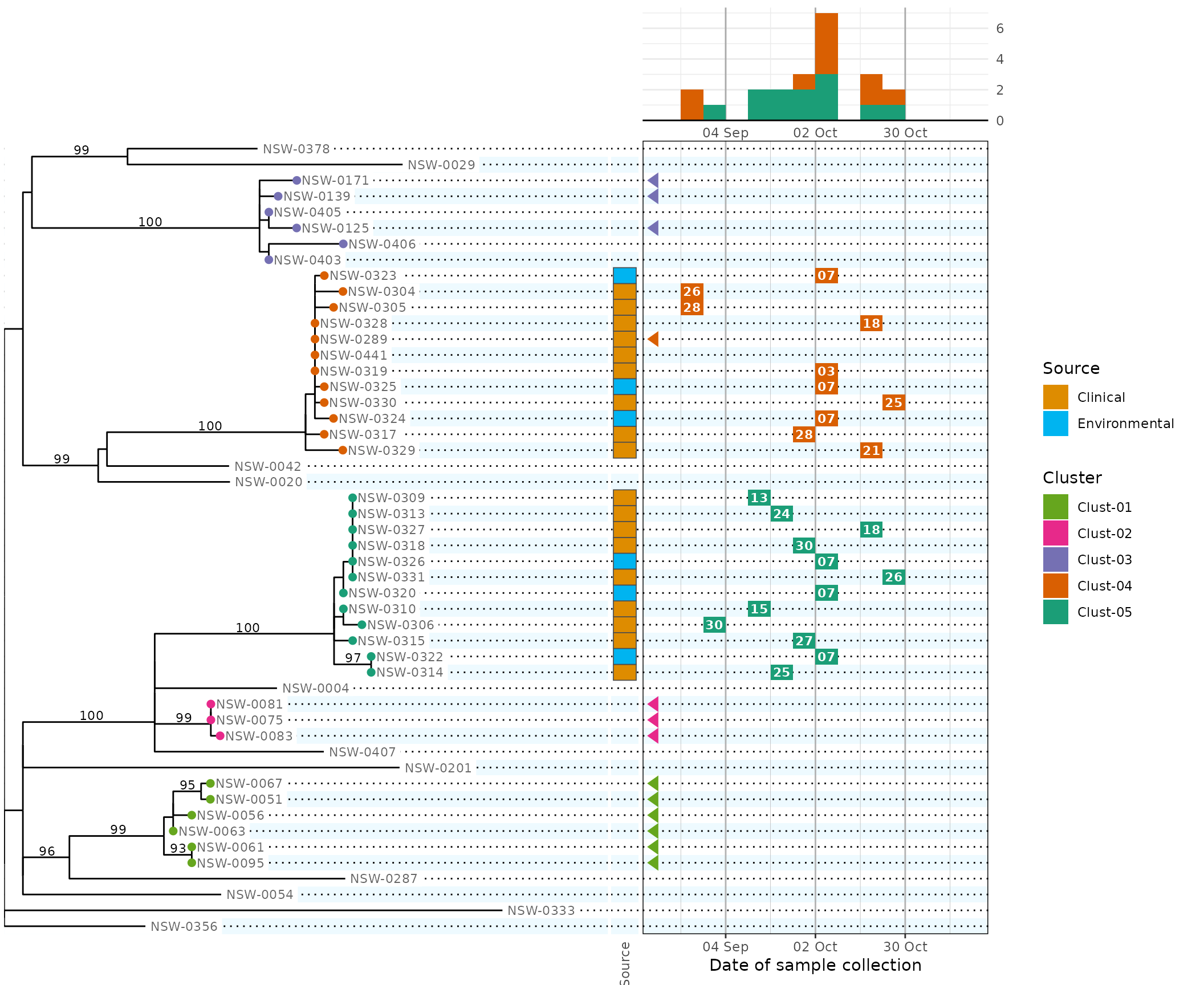
Because the cluster colour scales are consistent across panels, the legend guides are automatically combined.
The warning messages coming from ggplot are annotated to indicate which panel was responsible. Here the warnings are telling us that
- 11 tree tips couldn’t be drawn because they have no cluster,
- 8 rows (a subset of those 11) have known dates that are outside the
calendar axis range, but the arrows couldn’t be drawn because they have
no cluster and we configured the cluster scale with
na.translate = FALSE, and - 7 rows didn’t contribute to the epidemic curve because their date was missing or out of range.